
The evolution from skeuomorphic to flat/hybrid design reflects the average smartphone user’s familiarity with gestures, controls, and behavior. This shift creates opportunities for more minimal and streamlined experiences.
When designing an app, it’s crucial to devise a UX strategy that aligns with user comfort and familiarity. The goal is to create something intuitive with a minimal learning curve. This means avoiding complex language that might confuse users. Following the specific design guidelines of the operating system is highly recommended when developing a native app.
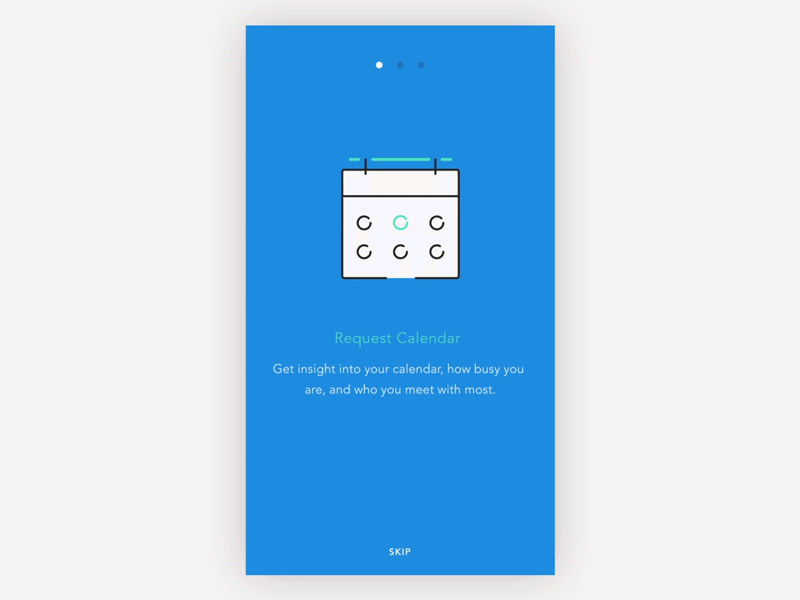
A common practice is to incorporate onboarding or walkthrough screens as part of user initiation. While effective, it’s crucial to strike a balance to prevent overwhelming users and causing them to skip the process entirely, which would render it useless.
Another effective tool I prefer over walkthroughs is coach marks or instructional overlays. I find these more successful in conveying UI language and communicating ideas. Coach marks are concise, focusing on specific tasks rather than overwhelming the user with the entire application at once. They are particularly useful for introducing new features to users.
Coach marks can be animated to demonstrate gesture features or hidden elements in the UI, which users might otherwise overlook.
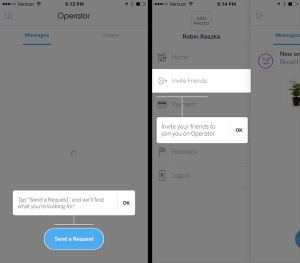
Coach marks also work really well for those relatively complicated flows/interactions that might be unique to your application.

Link: http://pttrns.com/applications/380

Link: http://pttrns.com/applications/377
Although in a lot of scenarios, onboarding is required, yet coach marks seem to be very effective in directing the users to the point without, complicating and eventually confusing them. Similarly I believe that rather than having a lengthy sign up form, it is better to have a minimal signup process and prompt users for information when absolutely necessary.

So what’s the conclusion? Walkthrough or Coach Marks?
Also you didn’t cater web part of it as which one is more useful?
I’ve tried to highlight the advantages of using coach marks in any UI design, whether it be web or mobile. Besides that it is up to the you what tool you choose that fits best in your scenario, It might even be a combination of both.