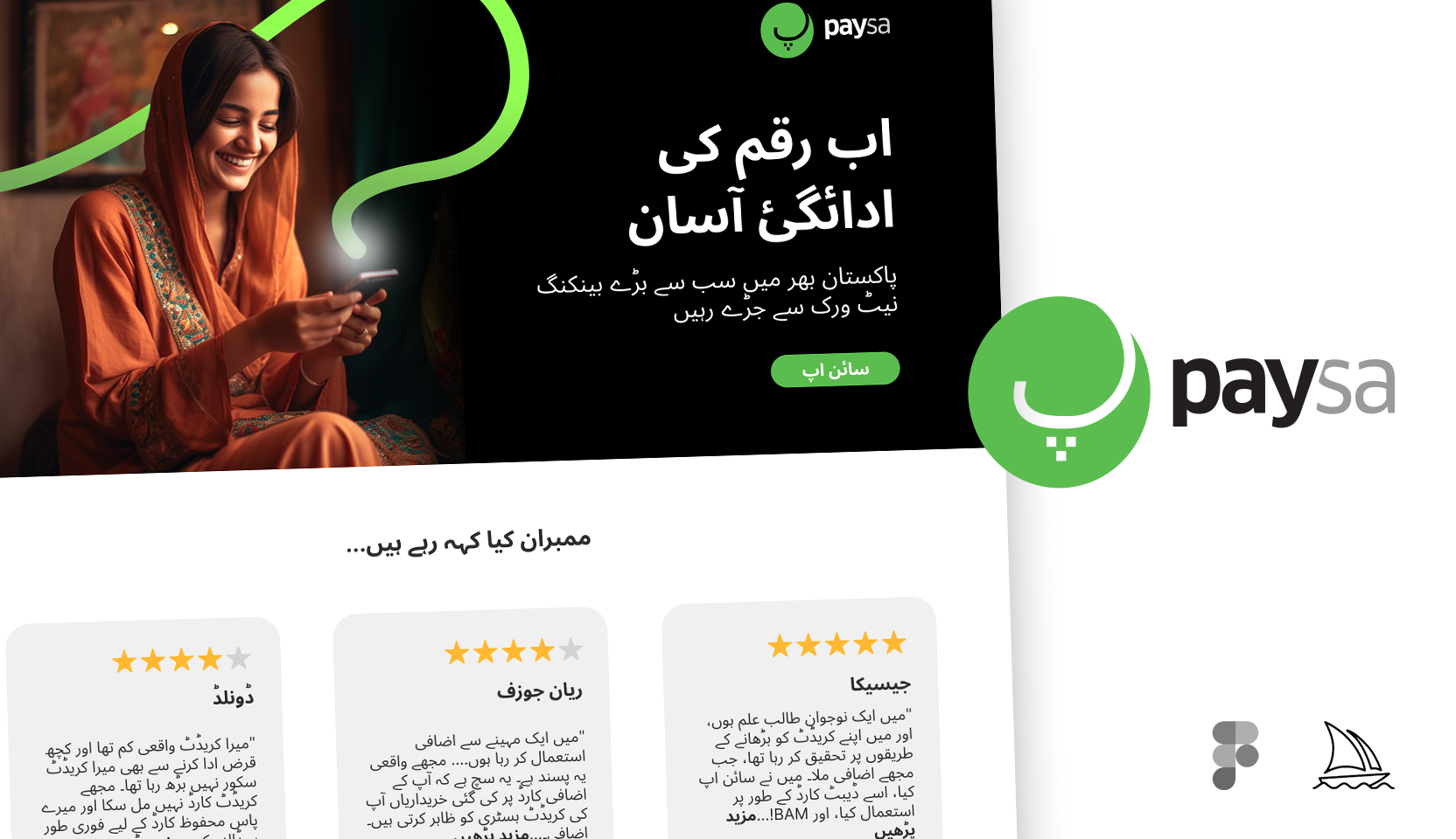
Portfolio UI/UX DesignJune 14, 2023 PaySa, Payments Ecosystem A concept multilingual branding exercise leveraging the power of midjourney for imagery; forging the visual language of a… Sherjeel
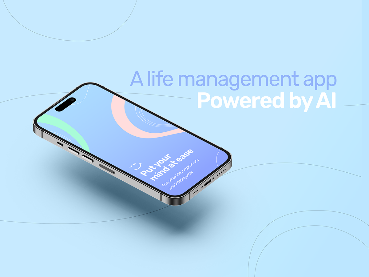
Portfolio UI/UX DesignJune 10, 2023 Life management app – Powered by AI (Concept) A concept task management app powered by an AI model that essentially facilitates in all aspects of life… Sherjeel
Blog Design DecorumMarch 16, 2016 Walkthrough vs Coach marks The evolution from skeuomorphic to flat/hybrid design reflects the average smartphone user’s familiarity with gestures, controls, and behavior.… Sherjeel
Blog Design DecorumMarch 12, 2016 Breaking the 72dpi myth: Blues of mobile/screen UID I thought I should address this in my own simple way. So I will keep this as simple… Sherjeel