I thought I should address this in my own simple way. So I will keep this as simple and concise as possible, without delving in to too much details.
Since the beginning of my career in digital design, I have always considered the 72 dpi as the standard medium for designing digital artwork/graphics. This mantra of 72 dpi is for digital and 300 dpi is for print was never really widely questioned and maybe out of procrastination or pure ignorance, I was never bothered about this in the kick off of my career and to ask the origin or science behind the 72dpi rule.
Some basics
Although our focus here is on ‘dpi’, it is important to revisit some other basic units of measurement. So, let’s take a crash course on the semantics of related measurement units.
- Pixel is defined as a single dot of colour or a picture element (hence pix-el) on a screen. Basically the smallest unit of measurement for screen devices.
- Screen sizes Physical measurement of the display area (widely measured in inches)
- Resolutions is the measurement of the width and height – e.g. 1024w x 768h
- DPI/PPI (Dots per inch or pixels per inch)
- Points (pt) is the smallest unit of measurement of a font, determining it’s size, leading, kerning etc. The unit is also used on screen, as an abstract unit of measurement.(also used in iOS)
- Density Independent Pixels (dp/(dip) is an abstract measurement of pixels in Android.
The origin of 72dpi
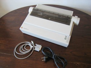
It all started with apple’s attempt to match the size of text on screen to the size of the text when printed. This was termed as WYSIWYG (pronounced “wiz-ee-wig”) or (What You See Is What You Get). This was done by matching the screen resolution of apple’s then computer screen to the Apple’s ‘ImageWriter'(a dot-matrix printer) first introduced in 1983. So for example a 12px on a mac screen would display the result exaclty how the image and text would look like when printed. This method worked for mac alone, since early version of PC desktops were 96dpi which made macs a natural fit for early desktop publishing. The ‘WYSIWYG’ method is almost impossible today due to a huge variation in screen sizes.
A common myth/misconception about dpi/ppi
Myth: DPI/PPI settings have an impact on the size of the file when working on digital design
Busted: DPI/PPI settings doesn’t have an impact on the size of the file. It is only used to measure the font sizes with accuracy across screens and other platforms. Images are irrelevant to dpi (when designing for digital), and will be displayed on screen according to whatever pixel dimensions the image is. Meaning, an 800 x 600 pixel image will show up smaller on a screen that is 1440 x 2560 pixels (Samsung galaxy S6 edge) than say a screen that is, 1280 x 1920 pixels (Samsung Galaxy S4 screen resolution). This is because both phones have a different pixel density and a high pixel density screen will squeeze in more pixels per every inch that the lower ppi device. Eventually having no impact on the file size of the actual image itself.
Exercise: Let’s do an experiment just to make sure if dpi settings would impact the size of file/image and also the font measurement.

1.Create a random photoshop file with a combination of text and an image.
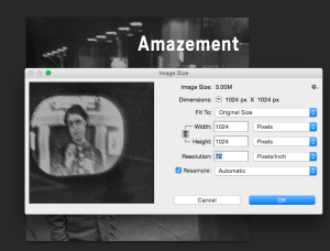
2. You may choose any pixel dimension such as 1024 x 1024 pixel used here.
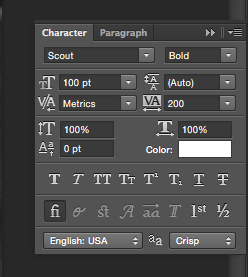 3. As you can see the font size of the word “Amazement” is 100pt.
4. I change the 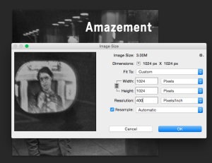 ppi from 72 to 400.
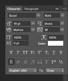 5. Check if the font size changes (It changes to 18pt in the current scenario)
Conclusion
Font sizes change according to dpi/ppi but the image resolution is unaltered. In a reversed situation, where i only change the resolution to double the size (2048 x 2048 pixels), the size of the font will also double (200pt).
Designing for mobile
I would like to cover the basics of designing interfaces or any graphics for mobile devices and some rules that i personally follow before i begin to work for screen based artwork.
1.Know your screen
Before we know anything about the screen/device that you’re designing for, you should know the screen that you will be designing on.
- Standard/recommended resolution for your screen is vital for designers to correctly measure design artefacts and anticipate outcomes on other screens.
- Pixel density or DPI is absolutely crucial to design accurately for mobile devices and it is important that not only know but also set the ppi/dpi in document settings same as the screen your working on.
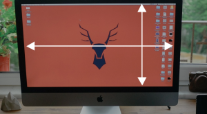 2. How to measure your monitor’s screen density
In order to measure your screen density, let’s check the actual screen resolution of my laptop. It’s a MacBook Pro (made of course by Apple, the company that gave us the original 72 ppi standard many years ago). My MacBook Pro has a native display resolution of 1920 x 1200, so just as I did before, I’ll take that first number, 1920, which gives me the screen width in pixels, and I’ll divide it by the width of the screen in inches, which in this case is 14.4. So, 1920 ÷ 14.4 = 133.3, which I’ll round off to 133 pixels per inch. That’s a lot higher than 72 and even higher than my standalone monitor. I’ll do the same thing with the height, taking the height in pixels (1200) and dividing it by the height in inches (9). 1200 ÷ 9 = 133.3, again rounded off to 133 pixels per inch.
3. Know the screen
Now that you are familiar with your own screen, you should now get to know the screen that you are designing for. For example; if you are designing a mobile app UI for an iphone, you should know the standard resolutions of the target devices. If a client wants an app designed for an iphone, that can run on mostly all relevant devices that people in the targeted region are expected to be using currently and/or in near future, You’d finalise a list of target devices and then you set your canvas to the highest resolution amongst them. Since it is easier to scale down than to scale up.
Useful links:
Automatically get your screen dpi


Heya this is kinda of off topic but I was wondering if blogs use WYSIWYG editors
or if you have to manually code with HTML. I’m
starting a blog soon but have no coding experience so I wanted
to get advice from someone with experience. Any help would
be enormously appreciated!
Hi,
Almost all blogging platforms (build with a right frame of mind) are WSYWIG,since blogging platforms are basically consumer facing products build for a large audience.
WordPress is the most popular blogging platform with a huge & vibrant community of users & experts pretty much everywhere. It has a great WSYWIG editor with preview functionality and you wouldn’t have to worry about coding at all (unless you want to). It also offers a good level of control where you can customise elements, add features and widgets to your liking. Hence it has a really simple and easy-to-understand control panel, which you can get familiar with easily.
If you’re interested, I’d suggest starting off with a free blog site from wordpress.com and get familiar with the it’s offerings …OR…
Another cool platform out there is, http://www.medium.com (develpoed by twitter so you’d need a twitter account aswell for this). Medium is a comparatively controlled platform for blogging, for people who don’t want to worry about customisation and get right to typing away.
Besides the above there are tons of blogging platforms, but in my personal opinion none of them compares in an overall score, to the above.
Hope this helps.
This site is my inspiration , rattling good design and perfect content material.
I really like what you guys are usually up too.
Way cool! Some extremely valid points! I appreciate
you penning this article as well as the remaining portion of the website
is extremely good.
Your info is quite fascinating
It can be in fact a great and helpful piece of info.
I’m happy that you simply shared this useful info along with us.
Please stay us updated such as this. Thanks for sharing.
Hi, I think your blog might be having browser compatibility issues.
When I look at your blog site in Chrome, it looks fine but when opening in Internet Explorer, it has some overlapping.
I just wanted to give you a quick heads up! Other then that, amazing blog!
Great article. I’m handling a few of these issues as well..
I enjoy your site.. good colors & theme. Do you make this web site yourself or have you hire someone to make it
happen for yourself? Plz reply as I’m looking to design my blog and would like to know where u got this from.
thanks a whole lot
hello there and thanks for your information – I’ve definitely acquired something new from right
here. I did so however expertise some technical issues by using this site, as I experienced to reload the site many
times previous to I could obtain it to load properly.
I was wondering in case your hosting company is OK?
Not too I am just complaining, but slow loading instances times will often affect your placement in google
and can damage your high-quality score if advertising and marketing with Adwords.
Anyway I’m adding this RSS to my e-mail and could watch
out for much more of your respective intriguing content.
Make certain you update this again soon.
My brother suggested I might like this website.
He was entirely right. This post truly made my day.
You can not imagine simply how much time I had spent for this information!
Thanks!
Hi! Someone within my Facebook group shared this site with us so I
got to take a look. I’m definitely enjoying the information. I’m bookmarking and will also be tweeting this to
my followers! Superb blog and terrific style and design.
It’s a shame you don’t possess a donate button! I’d undoubtedly
donate to the brilliant blog! I suppose right now i’ll be happy with bookmarking
and adding your Feed to my Google account. I enjoy brand-new updates and may share this site with my Facebook group.
Talk soon!
Admiring the dedication you put into your site and detailed information you provide.
It’s nice to come across a blog every once
in a while that isn’t the same unwanted rehashed material.
Fantastic read! I’ve saved your site and I’m including your RSS feeds to my Google account.
Hello, I read “a 12px on a mac screen would be 12 inches when printed out.” but this is a big error, maybe a typo because it is so absurd… 🙂
In the old fixed resolution Mac monitors, a 12pt letter would be displayed as a 12 pixel character and printed as a 12 points typographic character. The correspondence was monitor pixels = classic typographic points.
It is a mistake and thanks for pointing that out.