Let me start with an honest admission: the most expensive part of my old design workflow wasn’t the tools. It was the process itself.
Long discovery phases. Wireframe rounds that existed to signal effort rather than produce clarity. Documentation that got written, reviewed, filed, and never opened again. Stakeholder reviews are scheduled around people’s calendars rather than around the actual needs of the product.
So the legacy bloat is what I see the whole process as, at this point. Considering we have a barrage of tools available at our disposal, which essentially reduce a significant amount of friction and create immense value, the process, in my opinion, direly needed that overhaul. Since most of what we were doing, especially considering a guy like me who has a vast amount of experience in this domain, was dialed in to that legacy workflow. It worked, It was refined, worked like a machine, and yet it was pulling me back to what was possible.
The was taken aback by how AI adoption really was helping some of the designers in the fraternity to really boost their processes and deliver outputs at a lightning-fast pace. Businesses want this, of course, and whoever delivers that efficiently is a winner, and they are now demanding this by default. So refining the workflow and making it more AI-efficient was an absolute necessity.
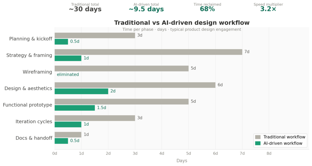
Over the past year, I’ve rebuilt almost everything. Not by chasing the latest AI hype, but by being deliberate about where the real friction lived and finding tools that actually eliminate it. The result is a workflow that moves roughly three times faster than before, with a total tooling cost that would make most design agencies uncomfortable to look at.
This article is about exactly how that works — tool by tool, phase by phase, and specifically why the stack is assembled the way it is rather than just what’s in it.
The Core Problem With the “Add AI to Your Existing Workflow” Approach
Most articles about AI in design tell you to bolt AI tools onto the process you already have. Use ChatGPT to write your research synthesis. Use Midjourney for moodboards. Use Figma AI to speed up layout. Then carry on as before.
That’s not what I’m doing, and it’s not why this works.
The gains come from redesigning the process around what the tools are actually good at — which sometimes means cutting entire phases, collapsing others, and deliberately routing different types of work to different tools based on their specific strengths. Some of the choices I’ve made are counterintuitive. I’ll explain the reasoning.
Phase 1: Planning & Collaboration → FigJam
Before any design work begins, there’s a phase that most designers either skip entirely or handle through a combination of Slack threads and meeting notes. I use FigJam for all of it.
This isn’t a new tool, and it’s not an AI play. But FigJam is underrated specifically for how well it handles time-boxed, collaborative exercises — kick-off sessions, journey mapping, priority sorting, rapid ideation with stakeholders. The whiteboard format makes decisions visible in real time rather than getting buried in a chat thread, and the timer and voting features mean you can actually run a structured session without it drifting for an hour.
What I’ve optimised here is how I structure those sessions. Instead of open-ended discovery workshops that meander, I run tight, focused exercises with a defined output: one FigJam board per session, one clear decision at the end. The AI angle comes later, but having clean, structured planning artifacts to feed into Claude makes everything downstream sharper.
Phase 2: Strategy & Problem Framing → Claude Pro
Before I open a design tool, I spend time in Claude.
I’ll dump everything in: the brief, my notes from the FigJam session, any constraints the client has raised, and my own initial instincts about the problem. Then I work through the framing. Is this actually the problem? What’s the most likely failure mode? What are the second-order consequences of the design decisions being discussed? What would a sharp, skeptical user say about the flow I’m imagining?
This is the work that used to happen across two weeks of stakeholder interviews and research synthesis. I’m not skipping the thinking — I’m compressing the time it takes to do the thinking rigorously, because I have a counterpart who can challenge assumptions faster than any meeting structure can.
The other thing Claude handles well is copy. Product copy — empty states, onboarding microcopy, error messages, button labels — used to be a late-stage afterthought that caused delays at handoff. Now it gets drafted during the strategy phase, refined early, and fed directly into the design. This sounds small. It isn’t. Designing with real copy instead of “Lorem Ipsum” changes the shape of layouts and catches UX problems that placeholder text masks.
Cost: $20/month Claude Pro. What it replaces in practice is somewhere between a research assistant and a senior thought partner for the strategy layer.
Phase 3: Design & Aesthetics → Figma + Make Design
Here’s where I need to be precise, because this is the most misunderstood part of any AI-assisted design workflow.
Figma’s Make Design feature is a design and aesthetics tool. It is not a prototyping tool.
The outputs it produces are visually competent — sometimes impressively so — but they’re essentially dressed-up static frames. The component logic is shallow, the interactions are cosmetic, and if you push it toward functional complexity, you’ll spend more tokens getting less reliable output than if you’d just designed the screens yourself. Make Design earns its place exactly where it’s good: generating a plausible visual starting point that I can refine, not producing something ready to hand off to a developer or put in front of a user for real feedback.
So my Figma workflow is intentionally scoped: I use Make Design to eliminate the blank canvas problem and establish a visual direction quickly. From there, the work is mine — refining the layouts, applying the design system, building out the component logic, making the calls that require actual design judgment. Figma is still the craft layer. Make Design just handles the setup.
I’ve also stopped doing separate low-fidelity wireframe rounds entirely. The traditional argument for lo-fi wireframes was that they kept stakeholders focused on structure rather than getting distracted by aesthetics. That’s a valid concern, but it’s a communication problem, not a design problem. I handle it by setting expectations at the start of a review (“we’re looking at flow today, not finish”) rather than slowing the whole process down by producing an extra artifact tier.
Cost: ~$15/month Figma Professional — a tool I’d be paying for regardless.
Phase 4: Functional Prototypes → Lovable (default) / Replit (logic-heavy)
This is where the workflow gets genuinely different from what most designers are doing.
Static Figma prototypes have a fundamental limitation: clients experience them as a design presentation, not as a product. They click through frames, they say “looks good,” and they miss the usability problems that only surface when something actually behaves like software. By the time real behavior is visible, in a developer build, you’re in a different phase entirely, and changes are expensive.
I use Lovable to close that gap. Lovable produces functional, interactive builds fast, fast enough that I can have something a client can tap through on their phone before the review meeting. Landing pages, onboarding flows, marketing pages, dashboard shells — Lovable handles these well. The output isn’t production code, but it behaves like a product, and that changes the quality of feedback dramatically.
For anything where the logic is more complex — a multi-step form with conditional branching, a data-driven interface, anything where the behavior of the thing is the design problem, I switch to Replit. Replit gives more control at the cost of more setup. The decision rule is simple: if Lovable can do it well, use Lovable. If the prototype needs to actually think, use Replit.
What this phase effectively replaces is the first dev sprint. Instead of handing off to a developer to build something the client can react to, I’m building a close enough version myself. The developer sprint, when it comes, starts from a validated direction rather than an untested hypothesis.
Phase 5: Code Quality & Prompt Efficiency → Claude Code in VS Code
One thing I’ve been watching closely — and want to start doing more of myself — is how some designers and hybrid practitioners are using Claude Code inside VS Code to get significantly better outputs with smaller, more precise prompts.
The principle is interesting. When you’re working directly in a code environment with full project context visible, Claude can understand the structure of what already exists rather than having to infer it from a prompt. You get outputs that fit into an actual codebase instead of outputs you need to manually integrate. The prompts can be shorter because the context is richer — Claude Code reads the files, understands the component structure, and makes changes that are coherent with what’s already there rather than generating something from scratch that may or may not plug in cleanly.
For a designer without a deep development background, this is interesting precisely because it lowers the cost of engaging with code-level decisions. You don’t need to be a developer to use Claude Code effectively — you need to understand what you’re trying to achieve, and be able to describe the design intent clearly. The tool handles the translation.
I haven’t fully embedded this into my own process yet, but it’s the next logical step — especially for projects where the Lovable or Replit output needs refinement rather than replacement.
Phase 6: Calls & Documentation → Google Transcribe + FigJam
This is the cheapest win in the whole stack, and the one that surprises people most.
I use Google’s transcription (built into Meet, available via a Google Workspace account) to capture and summarize client calls. I stopped taking notes in meetings a year ago. I’m fully present in the conversation, and afterward, I have a transcript I can run through Claude to pull out the decisions made, the open questions, and the action items.
No extra subscription. No separate tool. Already in the stack you’re probably already paying for.
Documentation itself, design rationale, system notes, and handoff context go into FigJam or Figma’s built-in annotation layer rather than into a separate tool. Keeping documentation inside the design environment means it stays current. Separate documentation tools create a second source of truth that drifts out of sync the moment the design changes.
Cost: $0 beyond what you’re likely already paying for Google Workspace.
What the Stack Actually Costs
| Tool | Purpose | Cost/month |
|---|---|---|
| Claude Pro | Strategy, discovery, copy, feedback triage | $20 |
| Figma Professional | Design, design system, Make Design AI | $15 |
| Lovable | Functional prototypes, landing pages | $20 |
| Replit | Logic-heavy builds and experiments | Free tier |
| FigJam | Planning, collaboration, documentation | Included in Figma |
| Google Transcribe | Call capture and summary | Free (Workspace) |
| Total | ~$55/month |
For context: a junior designer or research assistant engagement to help with discovery, documentation, and competitor analysis would run $1,500–$3,000 per month at a minimum. This stack covers equivalent ground — often better, because it’s available at 11 pm when you’re working through a problem — for roughly 2–4% of that cost.
The more important framing, though: most of these tools replace something I was doing more slowly, not something I was outsourcing. Faster delivery means more capacity. More capacity means either more clients or more depth on the clients I already have. Both are better outcomes than the old model.
The Honest Part: What This Doesn’t Fix
A fast workflow can still produce the wrong thing quickly. AI doesn’t know what your client’s users actually feel. It can model average behavior intelligently and usefully, but it can’t replicate the insight from watching a real person use your product for the first time and falter at a step you thought was obvious.
For high-stakes products like fintech, health, and anything where a misunderstanding has real consequences, primary user research still happens. The AI workflow compresses everything around it, but not the thing itself.
The other limit is originality. AI generates from a pattern. It will trend toward what has worked before, toward the statistical center of design decisions it has seen in training. The unexpected move, the decision that breaks the familiar pattern in a way that feels right precisely because it’s unfamiliar, that still comes from you. Use the tools to move fast through the decisions that are essentially solved problems. Save your judgment for the ones that aren’t.
The Actual Point
This isn’t about doing less. It’s about redirecting the same effort toward the parts of the work that actually require a designer.
I’m not spending less time on product strategy, user psychology, design system logic, or the calls that require human judgment. I’m spending less time on documentation overhead, blank canvas paralysis, redundant wireframe rounds, and the administrative drag of a process designed for a different era.
The work that remains is the work that matters. The tools handle the rest.