
An incremental evolve from skuemorphic to flat/hybrid design ideology is a proof that an average smartphone user of today, is familiar with the basic idea of gestures, controls and behaviour. Creating opportunities for more minimal and to the point experiences..
When designing an app, it is paramount to devise a UX strategy which coincides with user’s comfort and familiarity. The idea is to design something that is intuitive, and translates in to an experience which has a minimal learning curve. This dictates as a basic rule of avoiding verbiage that might elude the user’s comfort zone. It is also a big reason why it is recommended to stick with the OS’s specific design guidelines when designing a native app.
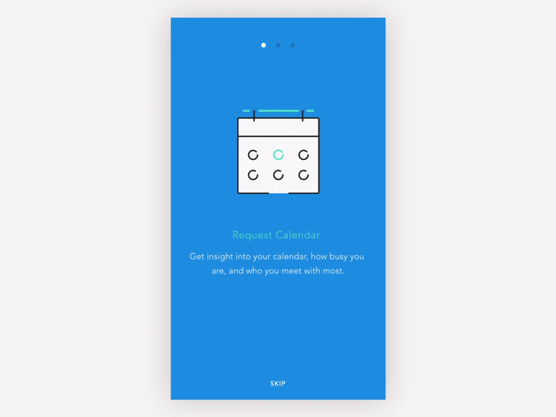
One of the mainstream idea is to place onboarding/walkthrough screens as part of the initiation for the users. This is a great method, which also requires care in not making the process too excessive, making the user skip it entirely (rendering it useless).
Another tool in the box is something i find more effective than walkthoughs, is the coach mark or instructional overlays. I personally think these are better in transferring the UI language and communicating ideas. Coach marks are to the point, hence only asking the user to understand the task at hand (not the entire application at once). Coach marks are especially great in telling the user about a new feature you might have added.
Coach marks can be animated and to demonstrate gesture features or easter eggs in the UI, which otherwise might have been neglected by the user.
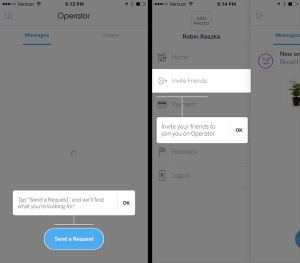
Coach marks also work really well for those relatively complicated flows/interactions that might be unique to your application.

Link: http://pttrns.com/applications/380

Link: http://pttrns.com/applications/377
Although in a lot of scenarios, onboarding is required, yet coach marks seem to be very effective in directing the users to the point without, complicating and eventually confusing them. Similarly I believe that rather than having a lengthy sign up form, it is better to have a minimal signup process and prompt users for information when absolutely necessary.
So what’s the conclusion? Walkthrough or Coach Marks?
Also you didn’t cater web part of it as which one is more useful?
I’ve tried to highlight the advantages of using coach marks in any UI design, whether it be web or mobile. Besides that it is up to the you what tool you choose that fits best in your scenario, It might even be a combination of both.